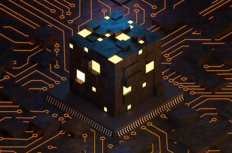
We once feared the glitch. It was a symbol of error, malfunction, or even digital death. But today, that fractured pixel, that warped audio, that broken interface — has become a deliberate aesthetic. Welcome to the age of interface decay, where the glitch is no longer a bug. It’s the message.
The Rise of the Glitch
Glitch first emerged as an accident: corrupted data, unstable signals, failing screens. But artists, designers, and technologists began to see beauty in the breakdown — in the unpredictability, the asymmetry, the chaos.
From experimental films and electronic music to digital fashion and UI design, glitch has transformed into a language of disruption.
Why Now?
There are several reasons glitch aesthetics are flourishing:
- 📱 Over-saturation of perfection
Sleek, minimalist design is everywhere — and it’s become boring. Glitch stands out. - 🧠 Cultural anxiety
We live in times marked by instability: climate crisis, AI uncertainty, and algorithmic overload. Glitch reflects that tension. - 🔄 Nostalgia
Broken VHS, analog tape warble, early internet artifacts — glitches evoke a yearning for tech’s imperfect past.
Interface Decay as Design Philosophy
In the world of UI/UX, perfection has long been the goal: clarity, smooth transitions, intuitive layouts. But some designers are now choosing intentional friction — inserting roughness, noise, or decay into the interface.
Examples of Glitch in Interface Design:
- 🌫️ Flickering menus
Interfaces that react with slight instability to user input. - 🪞 Distorted transitions
Page changes that tear, fold, or pixel-smear like a bad VHS cut. - 🖼️ Broken typography
Fonts that shift, stretch, or blur unexpectedly — drawing attention by seeming “wrong”.
This approach isn’t just aesthetic. It can serve as commentary.
Glitch as Message
When designers embrace interface decay, they often do so with purpose. The glitch becomes a form of digital critique:
- 🛑 Commenting on Surveillance
Interfaces that simulate distortion can evoke paranoia or fragmentation — echoing the fractured nature of online identity. - 🧩 Challenging UX norms
Breaking traditional interface rules can provoke users to question how much control they truly have. - 🧨 Exposing the illusion of stability
A cracked interface can remind us that systems — even digital ones — are not neutral, eternal, or infallible.
The Human in the Machine
Ironically, glitch design may be one of the most human aesthetics in digital culture. It reflects:
- Imperfection
- Fragility
- Mistakes
- Decay
In a world obsessed with optimization, glitch reminds us that not everything works — and maybe it shouldn’t.
Risks of Glitch Aesthetics
Of course, there are downsides:
- ⚠️ Accessibility
Overusing distortion or visual noise can make interfaces harder to navigate for users with cognitive or visual impairments. - 🧪 Miscommunication
Glitch used purely as decoration may lose meaning, becoming hollow trend rather than intentional statement. - 💢 User frustration
Not every glitch is welcomed. For functional tools, intentional “flaws” can feel like actual bugs.
Decay as a Form of Digital Poetry
At its best, interface decay turns the screen into a canvas of entropy. It captures the wear of time, the breakdown of systems, the beauty of things falling apart.
It’s not about chaos for chaos’s sake — it’s about reclaiming failure as form.
Conclusion: Beauty in the Breakdown
In a world that races toward seamlessness, glitch slows us down. It invites us to see the cracks, the fractures, the ghosts in the machine.
Interface decay isn’t anti-technology — it’s a more honest dialogue with it. One where the errors aren’t hidden, but held up to the light.
Because sometimes, the glitch isn’t what breaks the experience — it’s what makes it real.